The Supper Club Club brings together like-minded individuals to experience the many amazing Supper Clubs Wisconsin has to offer! This exclusive social club was founded in 2019 by Amanda Van Gorder, who commissioned me to create the brand identity.
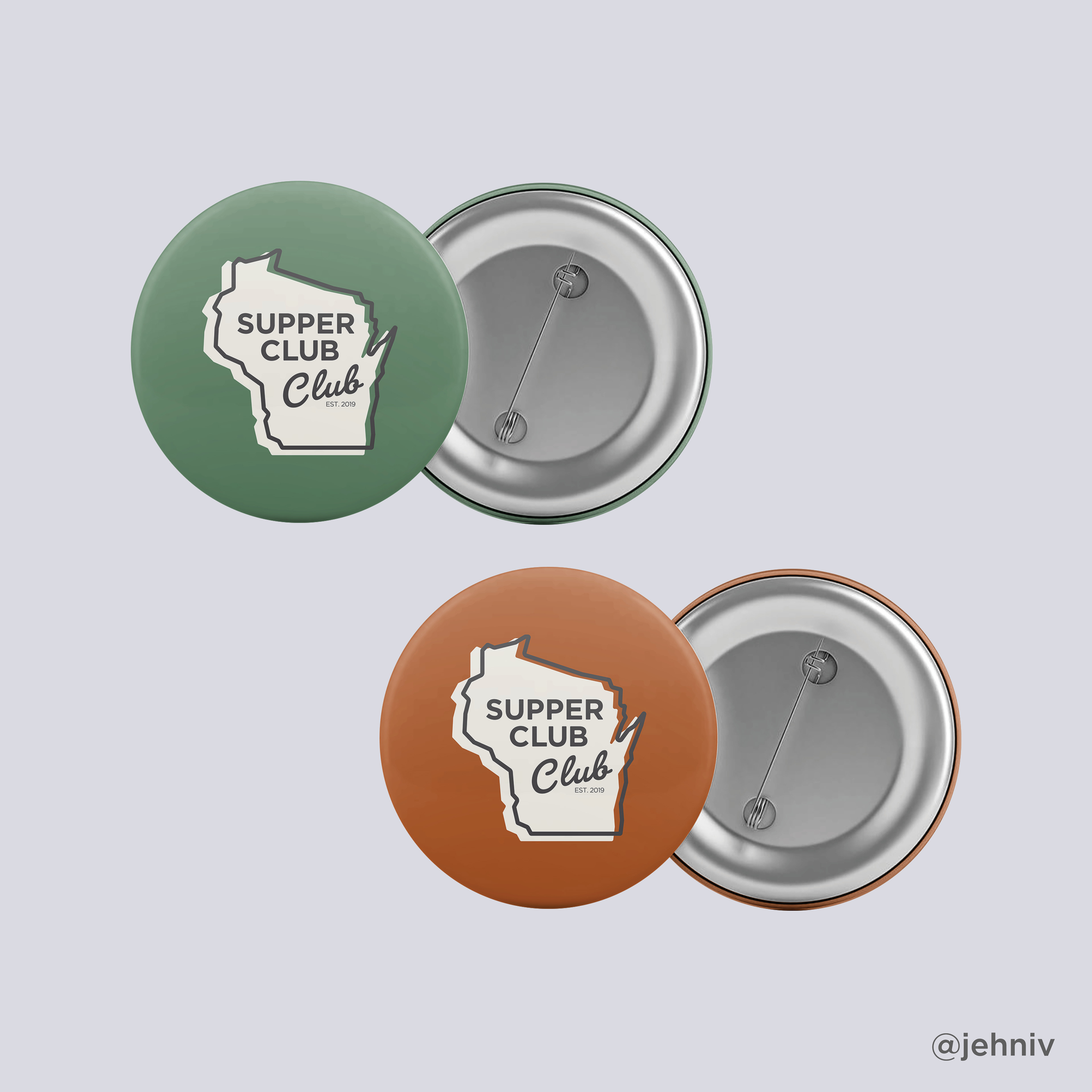
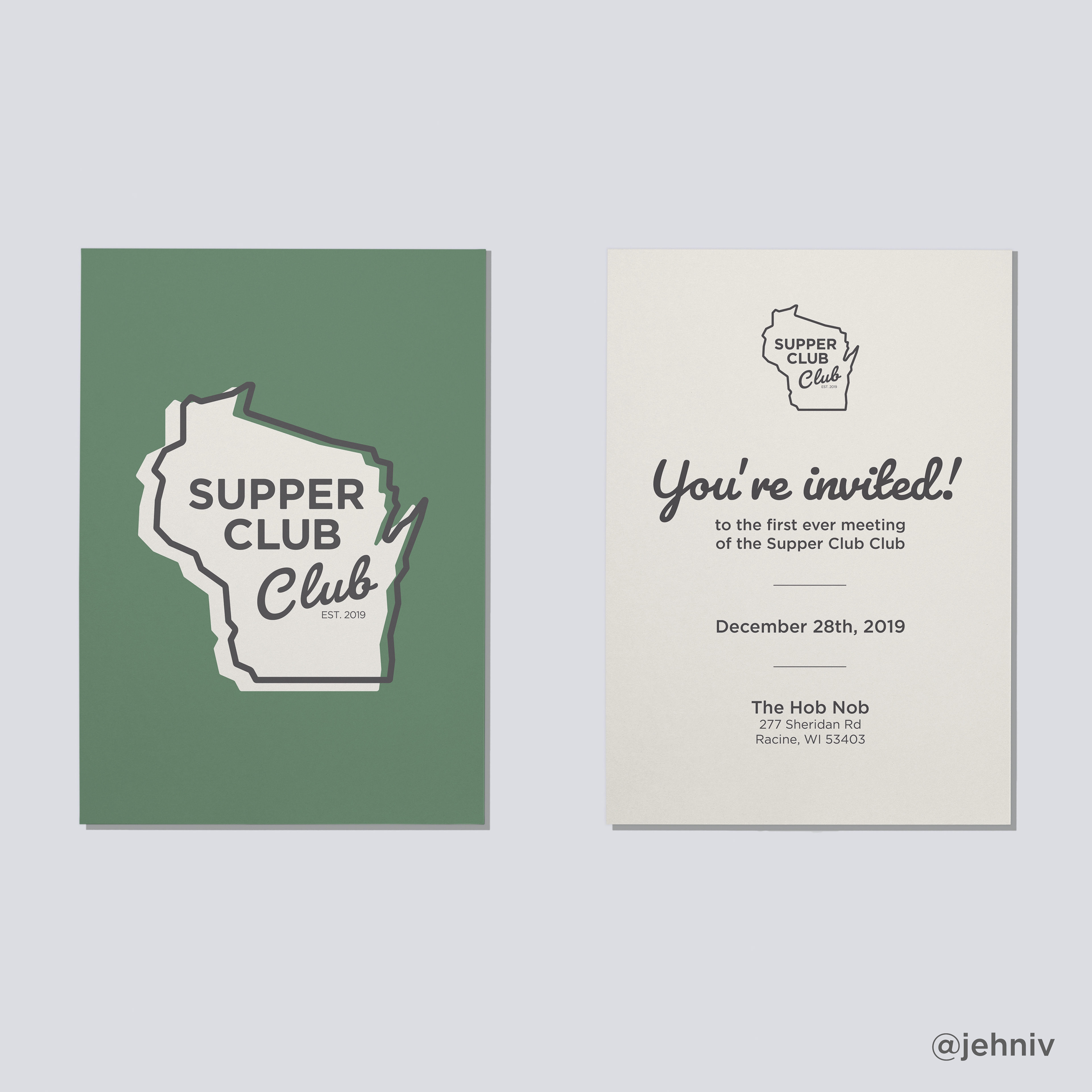
I wanted the logo to be clean and friendly—yet convey elegance, style, and timelessness. I feel these are core tenets of the Supper Club aesthetic. The logo needed to be adaptable for different colors, sizes and applications. In addition to buttons and invitations, we want to leave the door open to create custom-branded merchandise as well (glassware, clothing, etc.)
MY DESIGN PROCESS
This was one of my favorite projects I've ever worked on, from the research and brainstorming phase through the concept development and revision phase. This process gave me a glimpse into one of the most iconic bits of midwest history—the Wisconsin Supper Club.
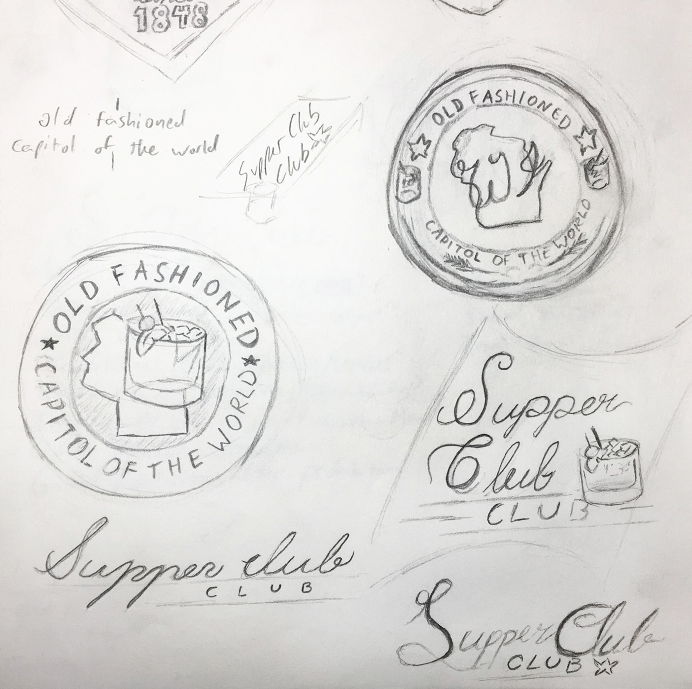
These are a few of the preliminary sketches, done throughout the research and brainstorming phase. We also went to visit a few higher end Supper Clubs to get more of an idea of what we were looking for. Supper Clubs are intimate settings flooded with nostalgia; understanding and building upon their rich history is very important to creating a lasting brand.
These are a few of the preliminary sketches, done throughout the research and brainstorming phase. We also went to visit a few higher end Supper Clubs to get more of an idea of what we were looking for. Supper Clubs are intimate settings flooded with nostalgia; understanding and building upon their rich history is very important to creating a lasting brand.
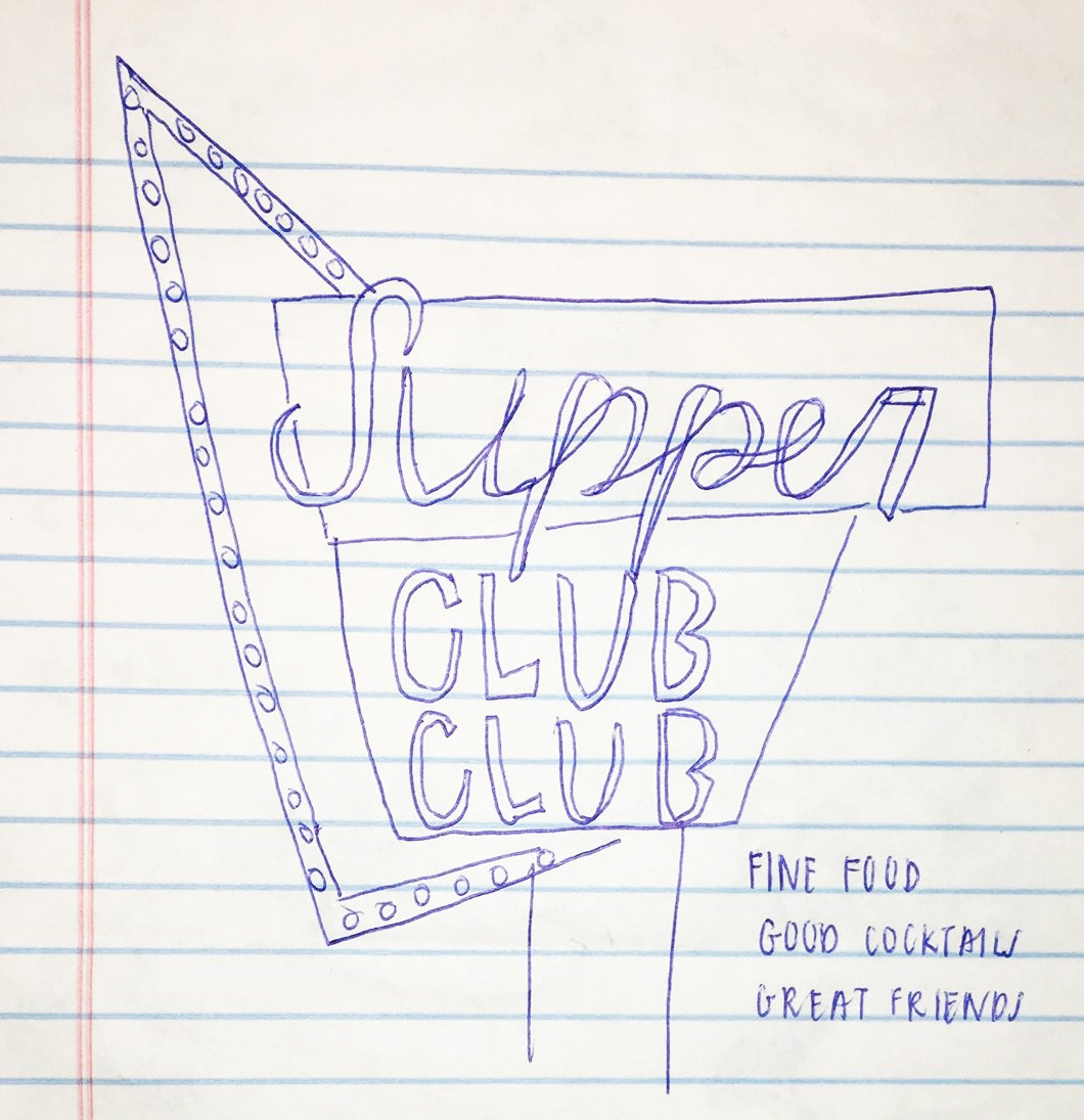


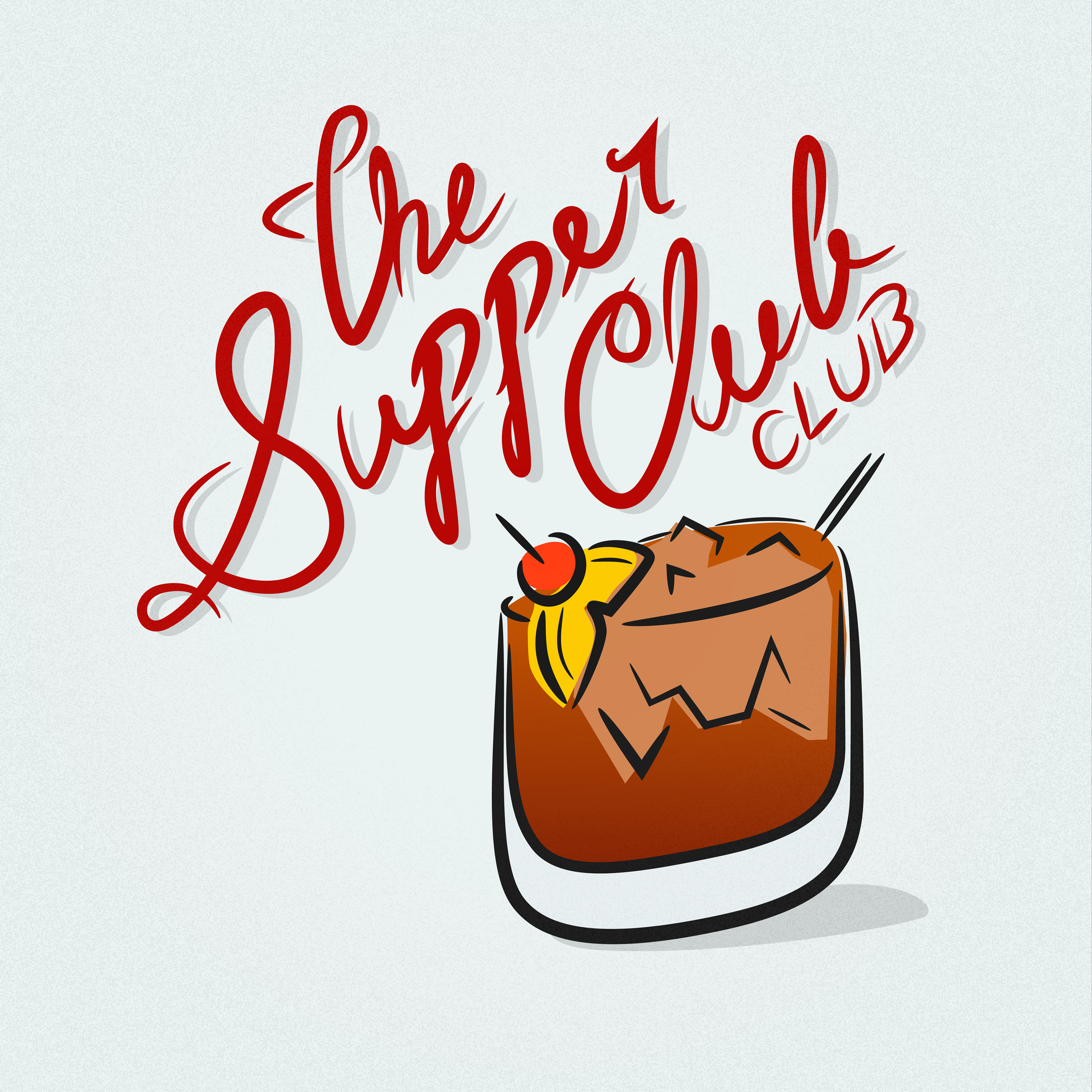
Below is the first concept we decided to explore.
For this option, I wanted to use hand drawn typography and playful iconography. In the full color version, I complemented the line drawing with a watercolor-like color splash in the drink. I used a rich red for the typography as it portrays elegance (and also reminds me of the maraschino cherries I enjoyed in kiddie cocktails when I visited Supper Clubs as a kid.)
For this option, I wanted to use hand drawn typography and playful iconography. In the full color version, I complemented the line drawing with a watercolor-like color splash in the drink. I used a rich red for the typography as it portrays elegance (and also reminds me of the maraschino cherries I enjoyed in kiddie cocktails when I visited Supper Clubs as a kid.)

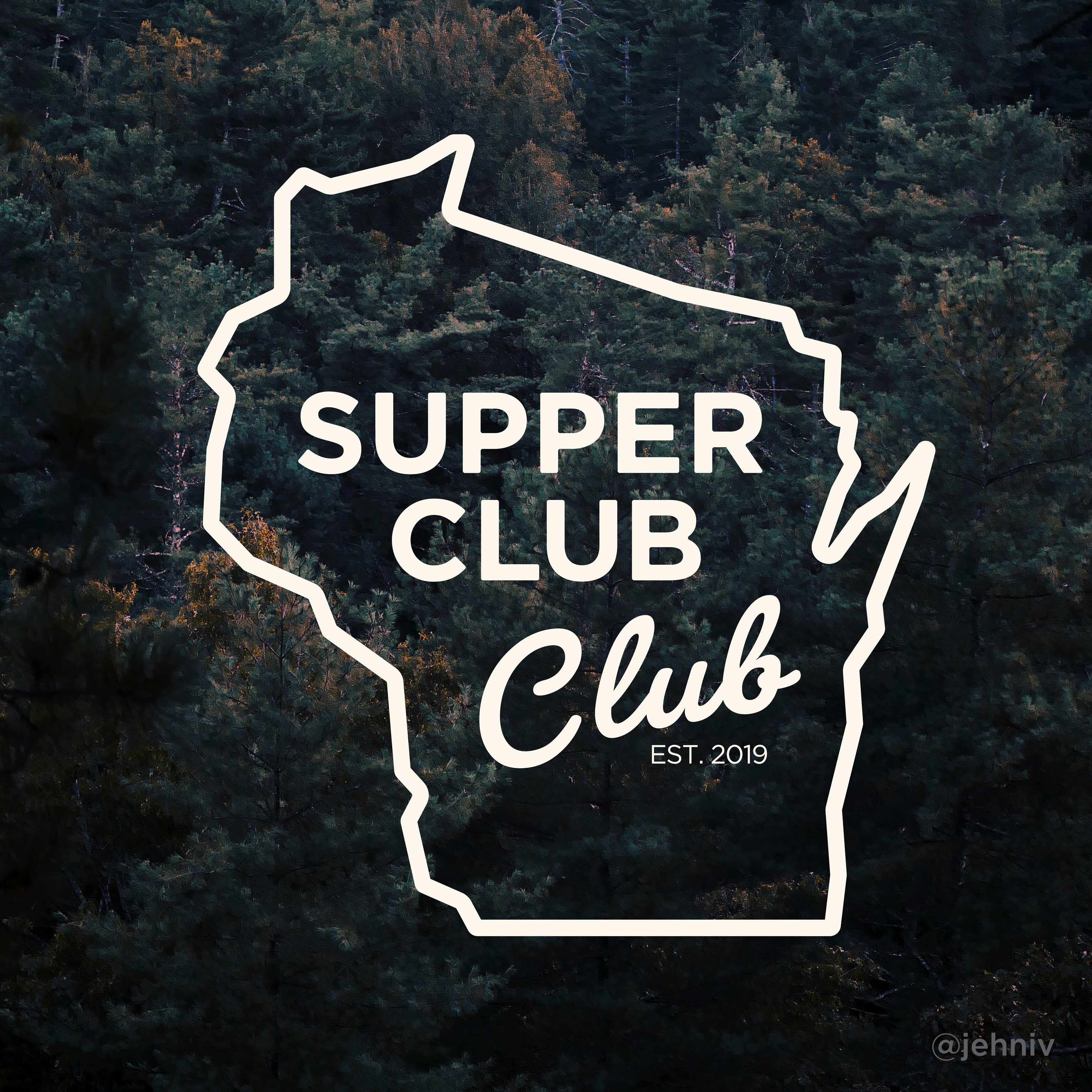
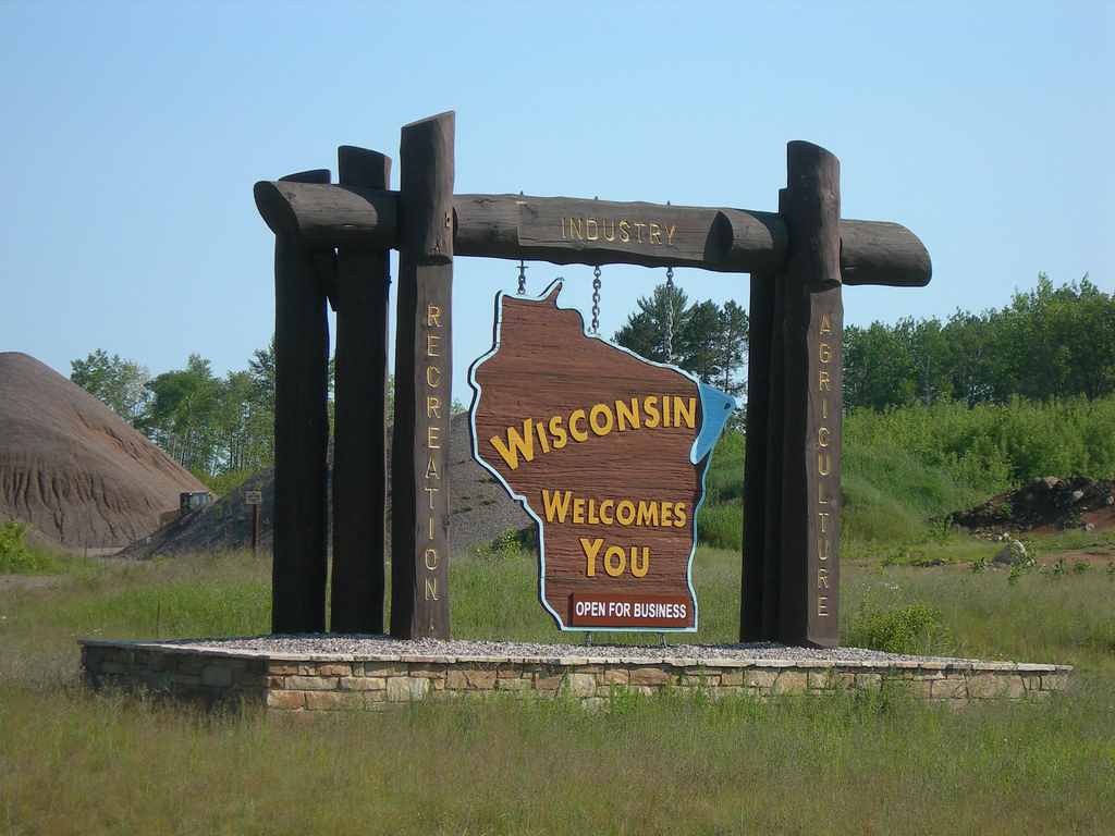
We decided to explore a slightly more sophisticated look that incorporates the shape of Wisconsin. Because Wisconsin is such an integral part of the club's origins and overall thematic purpose, we decided it would be more than fitting to include this as a major design element. I looked to the "Wisconsin welcomes you" sign I remembered seeing out the window as a kid for some inspiration.
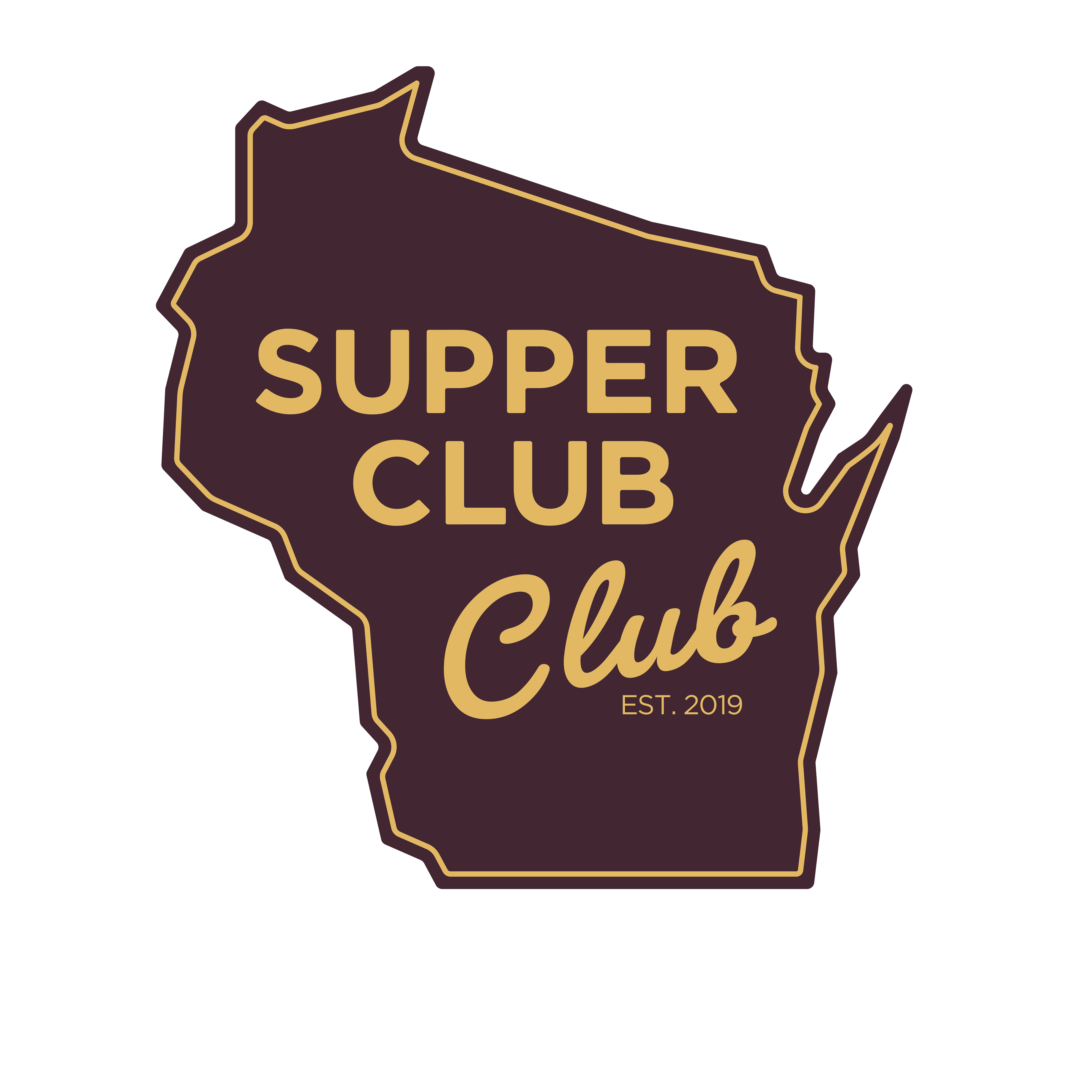
The first part of the name, "SUPPER CLUB", uses the Gotham typeface. I've always loved Gotham's clean & timeless look, which reflects classic 1920s era boxy sans-serifs. This is the perfect typeface for the style we want to embody. I chose a similar weight script typeface, Pacifico in order to differentiate the two "club"s from each other. I felt like Pacifico modernizes the logo, all while contrasting nicely with Gotham. I paid careful attention to the line-weight of the entire logo to be sure it will scale well. This gives it an understated, classic look that can endure for decades to come.
FINISHED PRODUCT

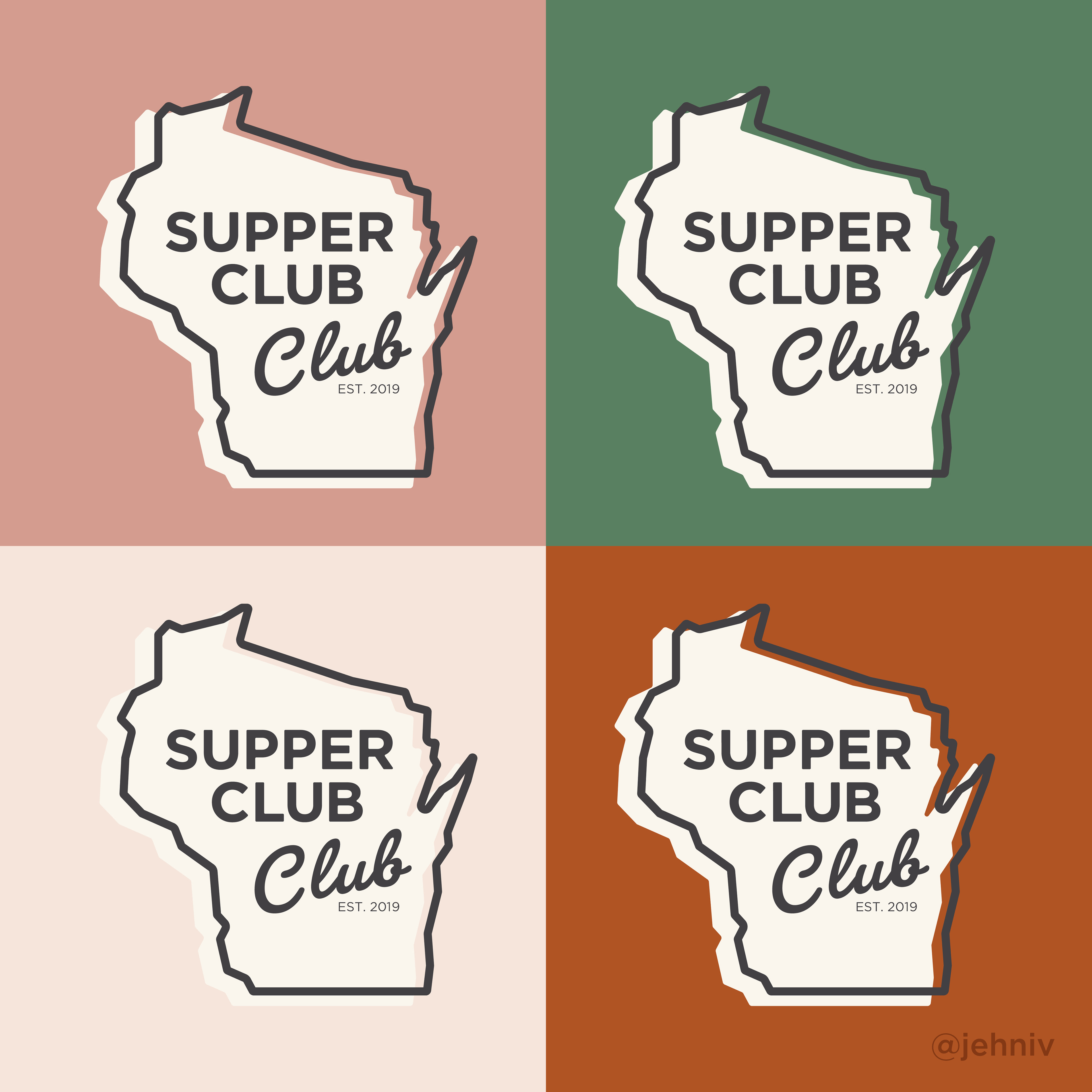
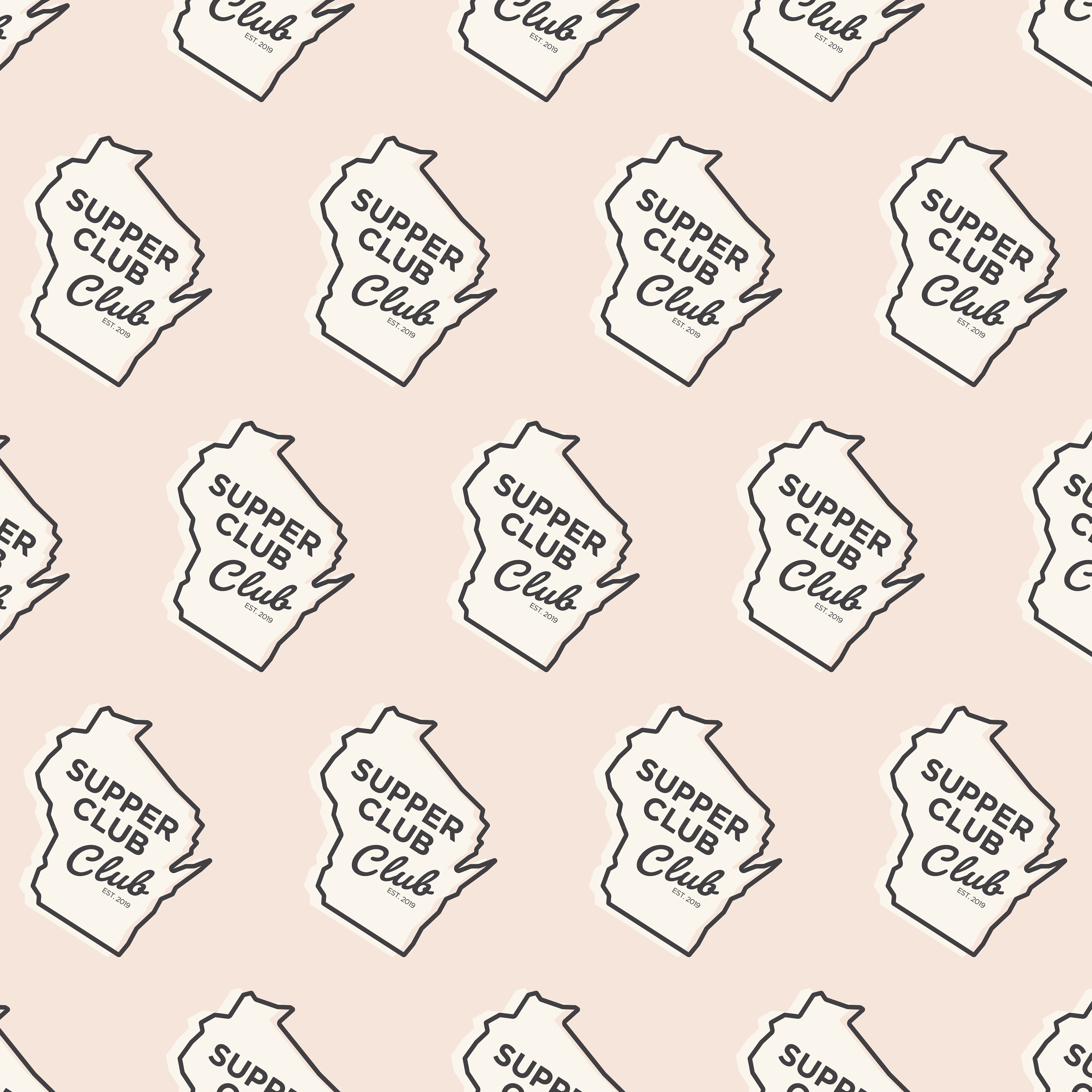
For the final color version of the logo, I used a cream drop shadow over various muted color backgrounds, which can be chosen based on the application/medium. These colors contribute to the vintage/classic look we were going for.

CONCLUSION & MOCKUPS
Overall, the client was very satisfied with the final product. I look forward to seeing the brand develop as we work to create new invitations, posters, fliers, and eventually clothing, etc. Thank you for taking the time to check out my portfolio!
